

A new feature that user testing dot com released recently was being able to launch surveys. Survey are great because they tend to get results back sooner and you can have a larger pool of testers usually.
I thought it was a great opportunity to create a survey to find out if people were correctly interpreting the icon used in our health plans to signify network size.
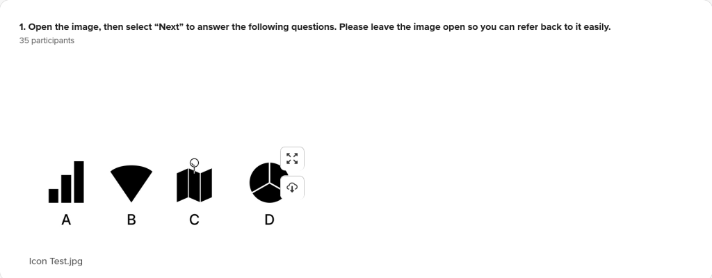
I started with some pretty general icons, things that people would be very familiar with.
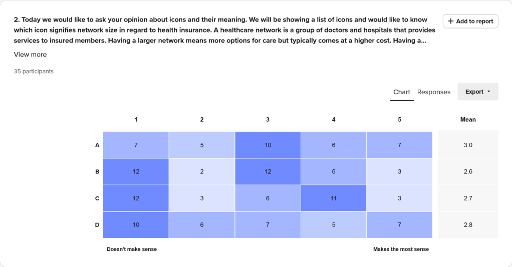
Then I had the testers sort the icons from “Doesn’t make sense” to “Makes the most sense”. Doing this it gave me more options for potentially doing a deeper dive.
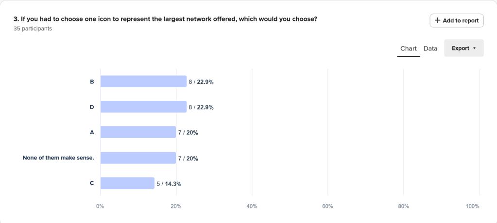
When asked to select a single icon, we can see pretty even spread among the choices.
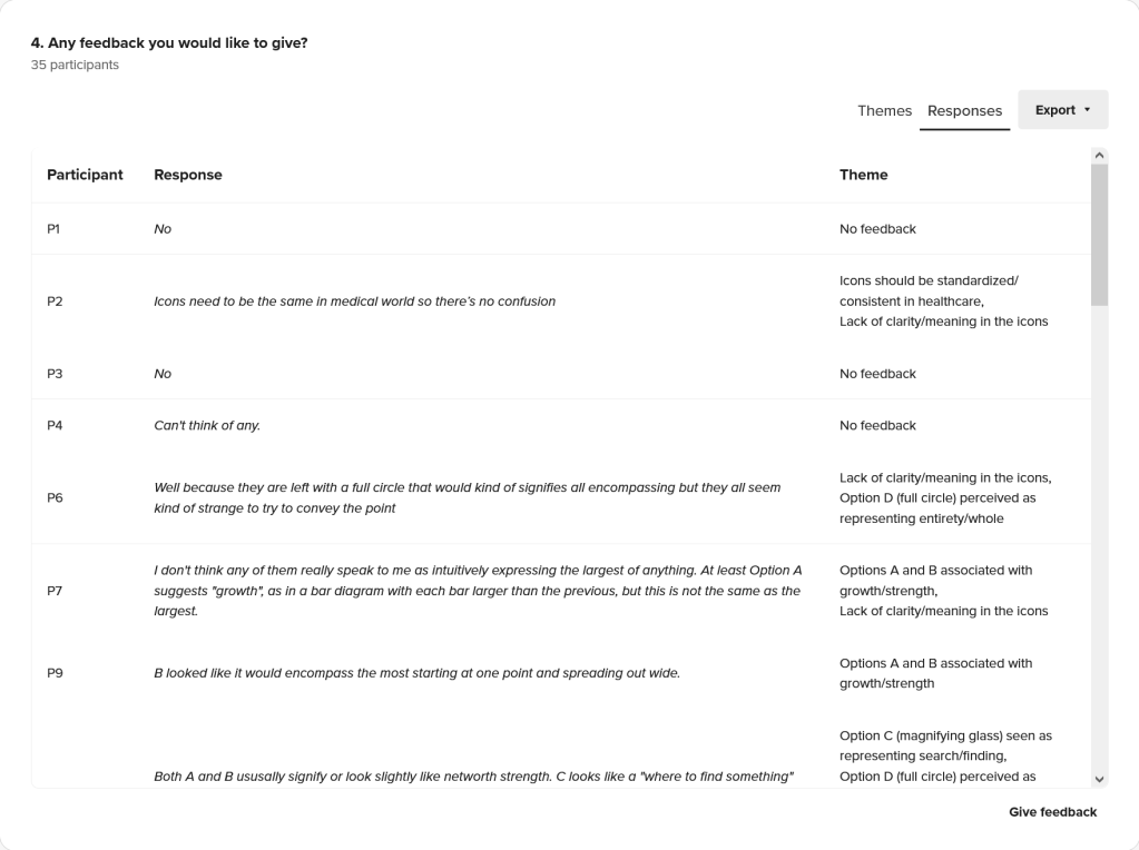
Finally just asking if they had any final thoughts they would like to share. One bit of feedback was that people were sure exactly what icon D was, one person even asking if the pin was a magnify glass.
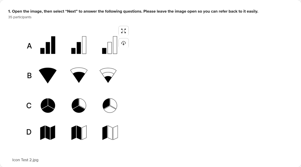
I felt it was necessary to follow with a new survey that showed the different sizes offered by the network. I wanted to see if it was more clear to testers if they could see the different states of these icons. I also went ahead and removed the pin from icon D, because there was some confusion there in the previous test.
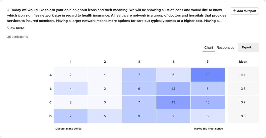
It was interesting to see that overall all the icons scored better here than in the previous test. I believe that being able to see the different sizes side by side helped to give testers context.
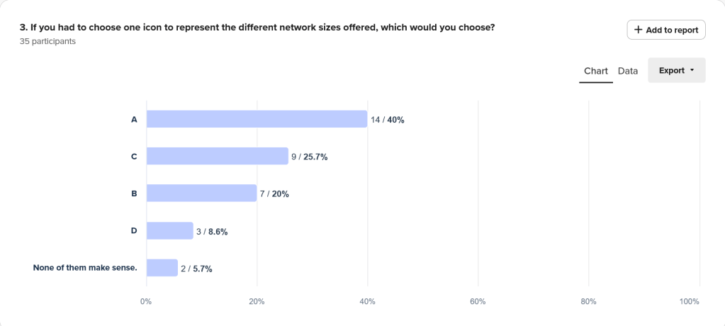
It is also good to see that we have a clear leader in which one testers would choose to represent the meaning of network size. To me this tells me the importance of given proper context when presenting data to users.
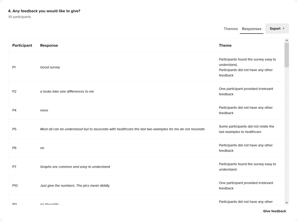
And we have final feedback. Its good to allow testers the freedom to share their thoughts, without relying exclusively to their actions.
