

I’ve been doing UX work at BCBSM for 4 years now and I wanted to show what a typical sprint looks like.
Grooming:
During grooming we meet as a larger group to go through which tasks are ready for work and assign story points and hours to them. This is great cause everyone gets to see projects at a higher level and see what everyone else is working on.
Kickoff/Brainstorming:
After projects have been assigned that’s when I get to work. I usually start by checking the task cards in jira to double check information and requirements. I also like to start reaching out to other resources if needed, cause we all know it can take some time to get responses back.
I really enjoy brainstorming, gathering info, researching, documentation, collaboration, throwing ideas on the wall seeing what makes sense, what falls off. There are a lot of moving gears and a lot of people working together, this can really make a lot of progress for a project if this stage goes well.
Standups:
Scrum leaders start getting a pulse on all the projects development, seeing and helping fellow team members with problems and issues is really satisfying. You get to see other career specialties that I often don’t think about. It’s cool seeing all these differences bring a project to the life.
Wireframes:
Ah wireframes, my preferred form of documentation and in my experience it’s preferred by most people. Through the years I’ve used In-vision, balsamic, axure rp, sketch, figma and even illustrator for my wireframes, but it always comes down to trying to portray an idea with lines and text boxes.
UserTesting:
At BCBSM we utilize usertesting.com for our user-testing needs. I’ve been pushing for more testing to be done at different points in the projects life-cycle. You win some, you lose some, but it’s definitely a win when you get to do more testing. Fun little story, we include competitive analysis in our research. You should have seen the look on my teams face when I suggested we user test our competitors sites. No laws saying we can’t. You’re welcome!
Here is a more in-depth look at some of the usertesting I conducted: BCBSM Usertesting
SME/Business Review:
First impressions leave lasting marks. It can be difficult to get up in front of people to present a project that you have been working on all week just to have it miss the mark. Setting expectations is something I try and put a lot of work into. You can meet expectations, surpass expectations, but if you miss expectations then you have to go back and fix something. This is a crucial stage in the life cycle of a project. You can have a killer solution that meets all the criteria, but if people are still left unsure, confidence falters, and a team needs to feel confident in the work being done.
Handoff:
Fantastic! The business and teammates gave their approval! The project moves onto the next stage and will be developed into a live portion of the public site! All hours burned, in-progress changed to complete and tasks closed. I like to follow up with the members of the development team to see if they have any questions or if they’d like me to walk them through the wire frames one more time.
Select projects during my time with BCBSM:
Transition from 6.1 to 6.5 styling standards
When I first started at BCBSM they were in the early stages of this transition. They had already received recommendations from a outside design firm that created all the new standards and documentation on the rules moving forward. It was then our job to go through the entire site and implement those rules and changes. At this time we didn’t have a component library in Axure RP, the prototyping program we were using. So I took it upon myself to create a whole library capturing all the new components being developed for the new site. Having this library greatly sped up the work in wire-framing and ensured that work was accurate to what was being developed.
After I developed the component library I was assigned the retail portion of the public website. Creating hundreds of wire-frames to make sure that all live content was accounted for and adhered to the new rules and standards.
Standard 6.1
Standard 6.5
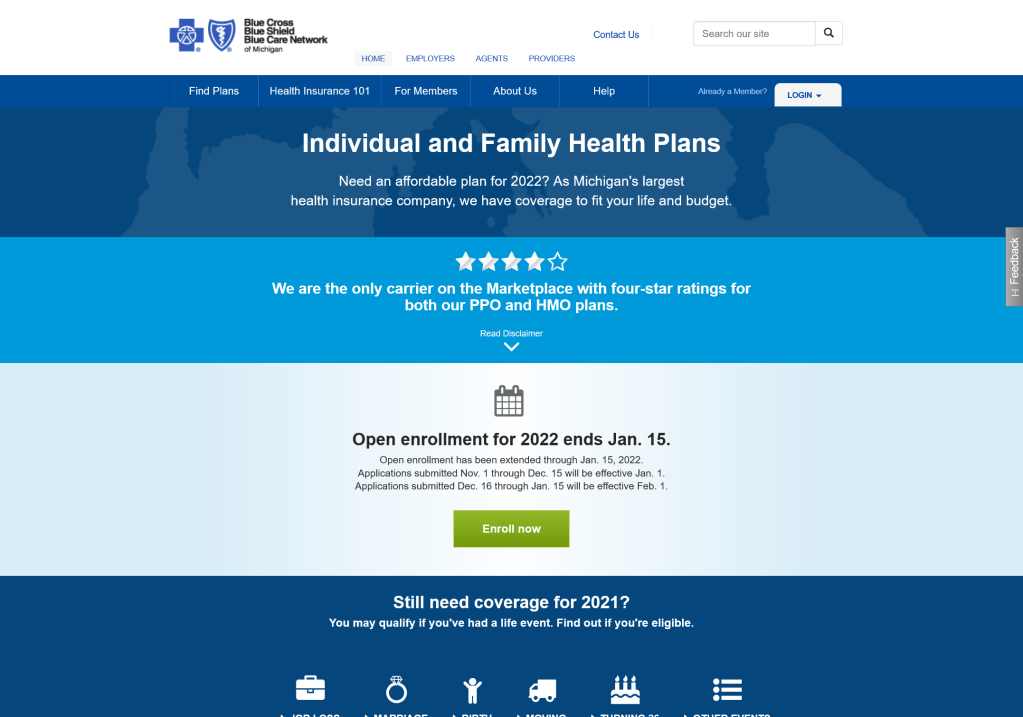
Individual Health Plans Forms and Documents
When you have lots of information and people looking for very specific things, you tend to get very frustrated users.
So I was asked to investigate how to improve the user experience in the forms and docs portion of our site. First thing I did was to look at the VOC (voice of the customer) available for this section, also requested to have analytics pulled for the year to date trying to find what I could about any main pain points people were having. What I found was people were having trouble finding what they were looking for and people were having to click and scroll too much to find it. With the analytics I was able to see which forms and documents were the most searched for or clicked on.
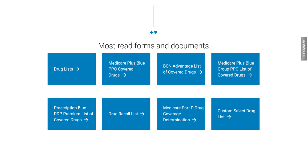
From there I started to wire-frame and reach out to teammates to figure out acceptable options that could address this issue. We work with tight requirements, both technologically and legally when it comes to certain things. Coming up with a solution that would solve the issue, allow for quick turn around was the balance I was searching for.
With that research this solution was delivered. Presenting users with direct links for documents or webpages. This solution quickly became the most used area in the entire forms and docs area of the website, and with it being updated a couple times of the year it became responsive to the needs of the user instead of complicated and static.
Redesign of the Mental and Behavioral Health Microsite
Leading the redesign of the behavioral and mental health site was a great opportunity to learn and research about the mental health space. Learn what our users thoughts on the subject are and find out what their expectations were for this resource.
Since this was a redesign of an existing site I was able to analyze the current traffic for the site. See how users are currently coming into the site, where they are going from the site and even the device they prefer to use on the site.
An audit was needed to look at the content, when it was written, how old the articles were and if the external links were still active. Needless to say the average age for the content was 4 years old. Yikes.
SEO data was also available for review. Seeing what types of topics users were searching for internally and what they typed to get to the page using google was very insightful.
User-testing was done to look at find-ability of the current site, trying to pinpoint potential bottle necks or drop off points that were potentially keeping users from getting to the site. Surveys were also sent out to help facilitate what types of topics or articles to include in the new site.
Personas, goals, user journey’s, each page had a purpose written out to help guide the design phase, design phases were created to introduce phased launches.
Personas: “I know someone who is struggling with their mental health, I am experiencing a mental crisis, or I am a provider with a patient who they are trying to refer a patient of mine”.
Goals: Educate users about behavioral health to give confidence in speaking up for themselves and talking to an expert. Reduce emergency room admissions, if doing so is not a risk to the person. Keep users within the Blue Cross Blue Shield of Michigan website (the current site had a lot of external links).
A way we could help achieve our goal of educating users was to expanded the mental health guides, currently there was a specific guide for six different groups. Men, Women, Seniors, Parents, Caregivers and Members. Even though it was good to have such a wide range of demographic groups represented, the writing and layout of the guides were too generalized. This sentiment was backed from user testing which showed a lot of these groups didn’t feel like the content was relevant to them.
(This work is currently on-going, I will update as the work continues forward.)
