When you have lots of information and people looking for very specific things, you tend to get very frustrated users.
So I was asked to investigate how to improve the user experience in the forms and docs portion of our site. First thing I did was to look at the VOC (voice of the customer) available for this section, also requested to have analytics pulled for the year to date trying to find what I could about any main pain points people were having. What I found was people were having trouble finding what they were looking for and people were having to click and scroll too much to find it. With the analytics I was able to see which forms and documents were the most searched for or clicked on.
From there I started to wire-frame and reach out to teammates to figure out acceptable options that could address this issue. We work with tight requirements, both technologically and legally when it comes to certain things. Coming up with a solution that would solve the issue, allow for quick turn around was the balance I was searching for.
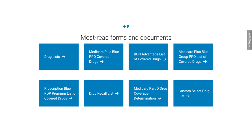
With that research this solution was delivered. Presenting users with direct links for documents or webpages. This solution quickly became the most used area in the entire forms and docs area of the website, and with it being updated a couple times of the year it became responsive to the needs of the user instead of complicated and static.